Project management is already a complex process, but a necessary one when it comes to creating a successful product or service. An S-curve shows how you can overcome challenges, avoid potential roadblocks, and improve your project execution. Here’s everything you need to know about the S-curve in project management and how you can use one to see even greater project success.
What is an S-Curve Graph in Project Management?
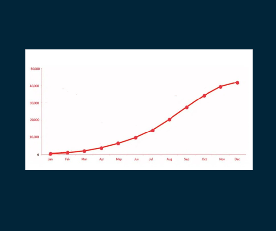
An s-curve is a mathematical graph in an s shaped curve used for project management to track the actual progress and data of a project — such as man-hours, costs, cash flow, or another resource — plotted against time (days, weeks, months, etc.). This visualization is called an s-curve because the graph often looks similar to a loose letter S.
The value of an s-curve is its effectiveness in tracking important real-time cumulative data that helps project managers keep projects on schedule and within budget. It may also help them evaluate individual team members’ performance and forecast cash flow. In short, these are a valuable way to ensure your project will meet its goal and requirements, while helping you communicate progress to stakeholders.
Why an “S”?
The graph often forms its shape because as the project continues to grow in the beginning stages, it’s usually slow. The wheels are just beginning to turn; team members are either researching the industry or just starting to engage in the first phase of execution, which can be slow before working out the kinks.
As more progress is made, the growth accelerates rapidly—creating that upward slope that forms the middle part of the “s.” This point of maximum growth is called the point of inflection. During this period, project team members are working heavily on the project, and many of the major costs are incurred. After the point of inflection, the growth begins to plateau, forming the upper part of the “s” known as the upper asymptote—and the “mature” phase of the project. This is because the project is mostly finished at this point and is winding down — typically only tasks such as finishing touches and final approvals are left at this point.
Common Uses of an S-Curve
Common uses of this graph are to measure progress, evaluate performance and make cash-flow forecasts.
They’re helpful in monitoring the rapid growth and success of a project because real-time cumulative data of different project elements, such as cost, can be compared with projected data. The congruence between the two charts indicates the advancement—or absence of it—in the element under examination. If adjustments are necessary to realign, the graph can pinpoint them.
These graphs are helpful for keeping track of the progress of a project. Following are some of the most significant uses:
1. Performance and Progress Evaluation
S-curves are typically used to assess the progress of the project and its performance. This is accomplished through earned value management. To determine your project's progress and even any future projections, internal and external factors must be considered, such as planned value, value earned, and actual cost. For the best results, all of these variables must be compared with the planned S-curve.
This assessment is useful as it can identify if the project is exceeding its budget or if any task is lagging in its timeline.
2. Quantity Output Comparison
By plotting cumulative quantities against time, this graph offers a visual representation of expected versus actual outputs at various stages of your project. This allows you to instantly recognize discrepancies between the planned and actual deliverables. For instance, if your project is anticipated to produce a certain number of units by a particular timeframe, any deviation from this expected output can be visually traced on the curve. By making these issues evident, this type of graph aids in ensuring that production targets are consistently met and assists you in making data-driven decisions when realigning resources or project schedules to meet project objectives.
3. Cash Flow Forecasts
This graph is also very useful when it comes to predicting cash flow development and the changes that occur from this. The main advantage of creating a cash flow curve is the ability to assess the requirement for cash and the exact timing of when the money is due.
4. Schedule Range of Possibilities
This is where the banana shape curve comes in. This curve provides a range of possible completion dates for your project. One type is the curve that presents the early dates, and the other presents the late dates of completion. Your project's beginning and finish typically overlap between these two forms of s-curves.
5. Predict When Resources will be Heavily Utilized
Drawing the curve allows you to pinpoint the phases when your project demands the most resources, whether that is in terms of cash inflows or heightened activities. This enhances precision in budget forecasting and resource distribution. It empowers you to confidently convey to your stakeholders the moments when significant portions of the project budget are required. It also provides clarity on when there might be a need to bolster your primary project team with additional contractors.
6. Find Flexibility
The banana curve integrates two S-curves: one illustrating the earliest commencement dates for activities, and the other displaying the latest initiation dates. This can be a valuable tool to identify wiggle room within the project timeline. However, it's important to note that if progress approaches the late S-curve, it's a strong indicator that project delays are imminent.
Managing Projects with S-Curves
S-curves are helpful when you want to visualize large amounts of data, generally tied to tracking progress and productivity.
There are multiple types of s-curves, including:
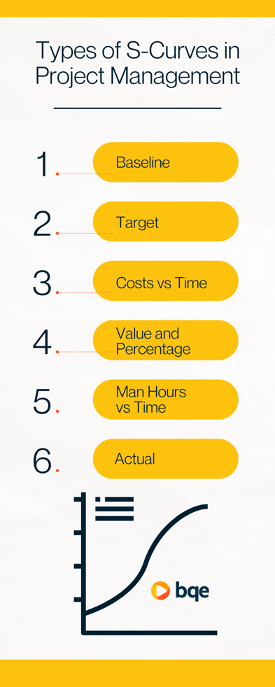
Baseline
Before a project starts, you create a schedule to plan out anticipated resource allocation and flow of tasks. This is your baseline schedule and the s-curve created from this schedule is a baseline, which shows anticipated progress. As the project progresses, you can revise your baseline schedule, whether you need to change scope, timeline, or task sequence.
Target
Once you start working on a project, adjusting your baseline schedule is common. This adjusted schedule is the production schedule used to produce a target s-curve, representing a project’s ideal progress if everything unfolds as planned.
If your project manages to remain within budget and on time, the target will intersect with the baseline. However, it’s more common that the target s-curve ends up above and to the right of the baseline, as many projects come in late and over budget.
Costs vs. Time
This s-curve displays the total costs incurred from a project’s start to finish date, including hiring contractors and paying vendors. This data helps you calculate total project costs and predict cash flow.
Value and Percentage
When creating an s-curve, you choose the resource you want to track against time — whether it’s employee hours, cost, or something else. A value s-curve is one that measures the hours or money contributed to a project so far and what’s needed to complete the project. Percentage s-curves compare your actual resource use to what was planned, so you understand how successful or off-track a project is.
Man-hours vs. Time
A man-hours vs. time s-curve is helpful for labor-intensive work, showing the number of employee hours put into every phase of the project. Man-hours refers to the human time needed and the number of hours it takes to execute a task.
Actual
Throughout the duration of a project, it’s common to adjust your production schedule. Revisions include actual data from work you’ve completed, which can be used to generate an actual s-curve. Comparing your target s-curve to actual s-curve helps you understand how realistic your plan was and how productively your team has performed. For many projects, the actual s-curve is lower than the target s-curve because of delays or schedule changes, but the curves intersect at the end of the project.
How to Make an S-Curve with Project
Management Software
Project management software significantly reduces the time it takes to make s-curves by granting you instant access to the data you need. With a platform like BQE CORE, real-time dashboards let you track and export the crucial project data you need to create these graphs, such as planned employee time, project expenses, milestones, and finish date.
Some of the reports you’ll find in BQE CORE include:
-
Planned value, which is the expected delivery value of work according to the original project plan.
-
Earned value, which tells you how much you've billed so far against the contracted total you're supposed to bill. It represents the actual value of your firm’s billed time and expenses for a project based on the time and expense entries you log.
-
Actual cost, which is the true total costs you accrue while completing work up until the project’s finish date.
As the project lifecycle goes on, BQE CORE records data based on the actual resources used and cash flow produced, which you can use to compare to your baseline s-curve. Seeing where the target s-curve is vs. baseline s-curve will help your firm adjust to get projects back on track and plan more accurately in the future.
Project Management Tools from BQE
Your firm’s project planning must be precise because so many factors can affect your ability to finish projects before the deadline, without going over budget, and to make your firm successful in the long run. Monitoring your data by creating s-curves and using project management software will help you keep an eye on expenses, cash flow, and employee time, so you foster long-term profitability.
Data from this graph is just a minor piece of what project management software can do for your firm. BQE CORE helps you plan and monitor projects and your team, with built-in expense reporting software and automatic billing software to keep you organized, efficient, and compliant. BQE CORE also has more niche, industry-specific offerings, including legal billing software and project management software for engineers.
To improve the outcome of your firm’s work and make your team more productive, get your free demo of BQE CORE today.