We have very exciting news for all of the project managers out there: CORE now has Gantt charts!
Gantt charts are an incredibly useful tool for organizing activities and resources along a timeline. With them, you can create a graphic representation of a project schedule in order to understand and manage team members’ responsibilities. They enable you to view and rapidly make changes to employees’ assignments as well as set dependencies between tasks. You can see how these components relate to the larger project timeline and assess the progress of everything in real time.
Benefits of Gantt Charts
Gantt charts serve many purposes, all of which lead up to better efficiency, happier employees and clients, and more profitable projects.
-
Quickly Understand Complex Information: Because a Gantt chart is a visual tool that centralizes different moving parts, it lets you rapidly understand information that can otherwise seem complicated. It shows you who will perform a task, when they’ll do it, and how that work relates to the entire project. CORE’s charts also enable you to easily see how many allocated hours have been used for a specific task, so you can judge your team’s progress.
-
Plan Resources More Easily: Given this easy-to-understand view, you can easily see which resources (i.e., employees, vendors, or groups of employees or vendors) are working on what. Moreover, you’re able to easily modify schedules. If a project or task gets delayed for any amount of time, all you have to do is drag a phase towards the right side of the screen.
-
Improve Productivity and Collaboration: These charts highlight task timelines and the dependencies between them, team members will get a better understanding of how their work fits together. This motivates them to stay on task and communicate with everyone else. Consequently, efficiency improves and no one gets left in the dark.
How Gantt Charts Work in CORE
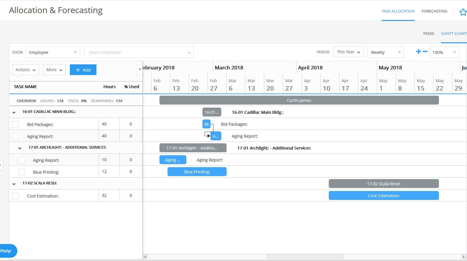
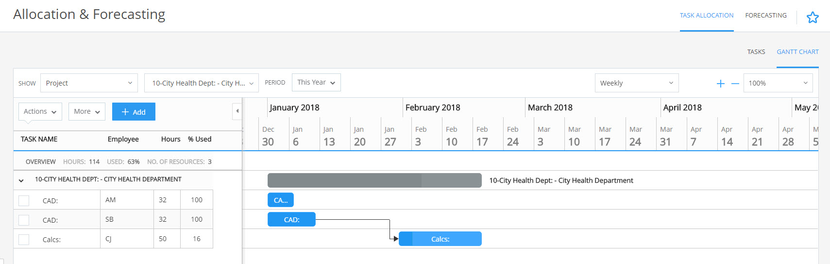
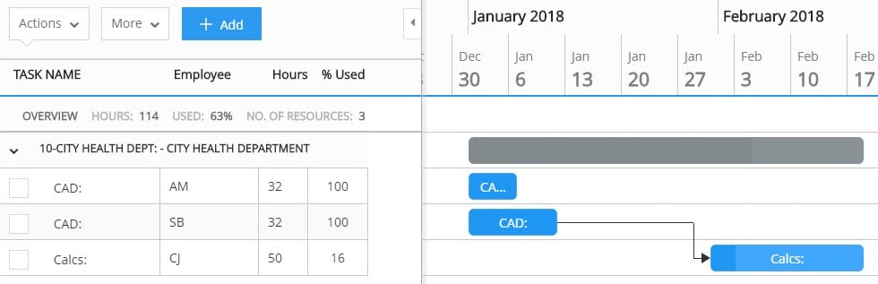
In CORE, you’ll find Gantt charts in the Allocation and Forecasting screen within the Projects menu. In this screen, you can choose to view the task allocations for an individual employee, project, or vendor, or a group of employees. The project view enables you to see all the allocated phases for a given parent project, while the employee view has the allocated tasks across all projects for the employee in question.
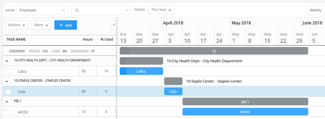 The employee view shows all allocated projects for a given person.
There is a panel on the left that displays task information as well as overview metrics. Here, you’re free to select any or all of the following summary columns to view:
-
Total hours assigned
-
Percentage of hours used
-
Percentage complete
-
Start and end dates
-
Duration (in days)
You can choose to view allocated tasks on a daily, weekly, or monthly level, and you’re able to zoom in and out on the chosen timeframe. Each blue bar represents an allocated tasks, while the gray bar at the top indicates the entire allocation for an employee, project, or phase.
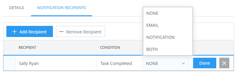
On the chart screen, you can add, delete, modify, link, and unlink tasks. Drag a task to change its start and end dates, or stretch it to change the duration. It’s simple to add delays or head starts to a given task, and CORE will alert you to any potential timing conflicts. Plus, if an employee or group of employees needs to know when a task is completed, you can simply set a notification!
Remember, everything in CORE is linked to your time cards, so whenever an employee fills theirs out, the related chart will be automatically updated with a new percentage complete. You can view the percentage complete in the information bar on the left, as previously noted, or by looking directly at the chart. A section of the bar for a given task will turn a darker shade of blue to represent how many hours have been used.
CORE’s Gantt charts give you a holistic view of your projects, so you can manage everything with ease. Combined with CORE’s other project management, accounting, time and expense, and billing capabilities, you’ll have the data and convenience you need for more successful projects and a more profitable business. To learn more about this exciting new feature, watch the video at the top of the post!